Duration
10 weeks, Sept - Dec 2017
My Role
UX researcher and designer
Food Watch - UX Research and Mobile Design
Eating healthy is hard, but it doesn’t have to be. This is made even more difficult for people with dietary restrictions who often fear trying new foods because of their hyper consciousness of what they can and cannot eat. Food Watch encourages people with limited time and money to eat healthily by showing them how easy it actually is to do.
Healthy eating is not a new idea - the abundance of online resources and apps prove that. Our goal for this project was to take a Human Centered Design and Research approach to 1. understand why these options are not being used and 2. propose a proof of concept design that promotes eating healthy.
Design Opportunity:
How can we help low individuals who wish to consistently eat healthy food but don’t have the time, resources or knowledge to do so?
User Interviews
To better understand our problem space, we decided to jump straight into user interviews after our initial research phase. Our goal was to better understand the attitude individuals had towards food while understanding people’s cooking habits and food related expenses.
Research methods:
Shadowing a low income student
We shadowed and observed the eating and food prep habits of one low-income student for a few days.
General interviews
We interviewed 6 college students of varied economic backgrounds. Additionally, we interviewed 1 local food bank.
Research Findings
Insight #1: “Food is not the issue” - Time is!
Miguel Jimenez, a Rainier Valley Food Bank representative, stated it best: “food is [often] not the issue.” Especially for low income individuals, their priorities are elsewhere in what they need help with and have the energy to work towards thus leaving little time for food
Aside from low income individuals, many interviewees also mentioned lack of time as a pain point which led leading to Insight #2 - food waste.
Insight #2: Reducing food waste
Some interviewees admitted to wasting up to half of their fresh groceries each week due to a lack of individual proportions available at stores and inadequate time within their schedule to plan the use of this over-proportioned food.
Insight #3: Cooking with dietary restrictions can be a challenge
Those with dietary restrictions cited finding cost effective, equally delicious alternatives and alternative recipes as their biggest challenge. Those with allergies stated that they tend to avoid cuisines or recipes which could potentially be problematic, but that they would have a desire to explore these cuisines if there were a resource to help them do so safely.
User Personas
From our interviews, we developed 2 main personas:
Ideating: Sketches
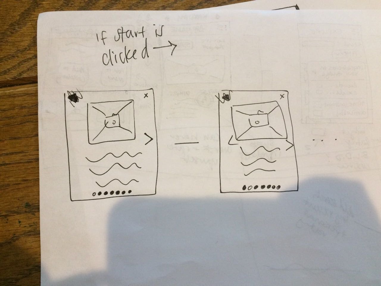
While we had a new design opportunity defined and personas to guide us, our scope was still too large. Sketching helped refine our ideas and led to our final goal: Get students to start food planning based on their budgets and dietary needs so their food prep is more efficient.


User Flows
We developed 2 usage flows that walked through how our personas would use our app. These stories not only helped us empathize with our users’ thoughts and emotions as they encountered difficulties in the food prepping journey but also helped guide our priorities during the wire framing stage.
2 User flows we focused on during prototyping: New users finding a recipe and creating a meal plan & shopping list
Low Fidelity Wireframes
After sketching and user flow development, we had a clearer idea of the information that needed to be displayed and how. We began further refining and playing with different layouts.
Refining Our Ideas
High fidelity wireframes
After several rounds of critique, we moved on to creating high-fidelity mock ups of our app. The motivation of the visual design was to create a simple but bold look and feel which we accomplished by
Reflection
Like many course projects, time constraints at the very end left little time to create the final mock up, and thus, our visual design suffered. That said, I’m proud of the design thinking and research we were able to accomplish during this project. One of the big things I learned was not to get caught up in the small details of the app as a whole. We focused on breadth when instead, our time could have been better spent polishing a more specific user flow.
If I were to work on this project again, I would:
Create a better defined branding focus through using more consistent visual design
Conduct more usability tests to validate information architecture and design decisions


