Duration
4 weeks, Dec 2020
My Role
UX Design, Usability Testing
Breathe - Zoom Extension Concept Development and Usability Testing
In the months following the Covid-19 Pandemic, Zoom fatigue has emerged as a big problem in work-from-home life, contributing to higher stress levels, anxiety, and exhaustion. Studies have shown that Zoom fatigue, a “burnout” felt due to overusing virtual communication, has been increasing our cognitive load, as well as levels of fatigue and stress. I felt this myself and saw this happen amongst my college friends as our university life made the transition online.
During this short, class project, my team and I decided to explore this problem space and develop a solution to help alleviate stress on Zoom. Our goal was to develop a stress-relieving feature to make everyone’s Zoom experience a little less fatiguing
Research
Analyzing Zoom’s UX
One of our goals was to stay true to the Zoom user experience, look, and feel, so we started off with an analysis of Zoom. Zoom has a relatively simple interface, but we distilled the Zoom experience into 2 main themes that we focused on going forward.
1. Focus on the people!
As a video calling app, Zoom focuses on the people. This is further solidified by their participant views: speaker view and grid view. The majority of the screen is reserved for people with content to the side.
2. Familiar, consistent UX patterns
Zoom has a relatively minimal navigation pattern. After a few uses, users can expect navigation to be on the bottom with some potential interactions on the side.
Brainstorm and Ideation
Initial brainstorm and ideation
To get things started, we did a quick brainstorm of different ways to relieve stress and categorized our ideas in an affinity diagram. One theme that emerged was mindfulness - specifically guided breathing exercises similar to Headspace. After getting positive feedback from our class, we decided to explore this idea further.
This exercises helped refine our design scope to be:
An activity that did not disrupt a Zoom meeting too much
Stayed within the Zoom environment
Sketching & Developing Story Boards
Next, we began sketching and story boarding. By focusing on a story, this helped us understand what different screens should be made and understand the context that our feature may be used. On every screen, we made sure to include people, a key theme that emerged from our analysis, and follow familiar Zoom UX patterns for seamless integration.
Low Fidelity Wireframes
We continued to validate our idea through the use of low fidelity wireframes with a goal of using them for usability testing.


Exploring Motion - LoFi Development
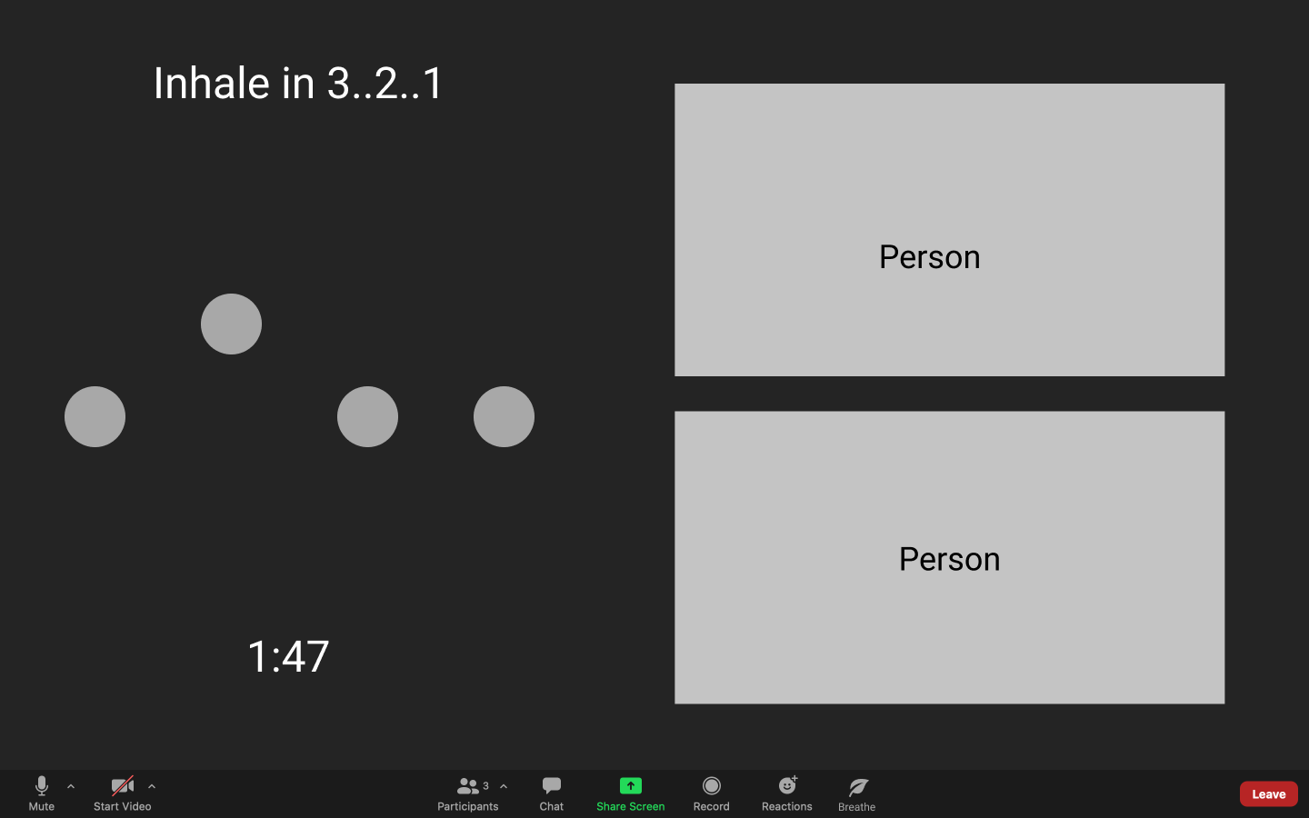
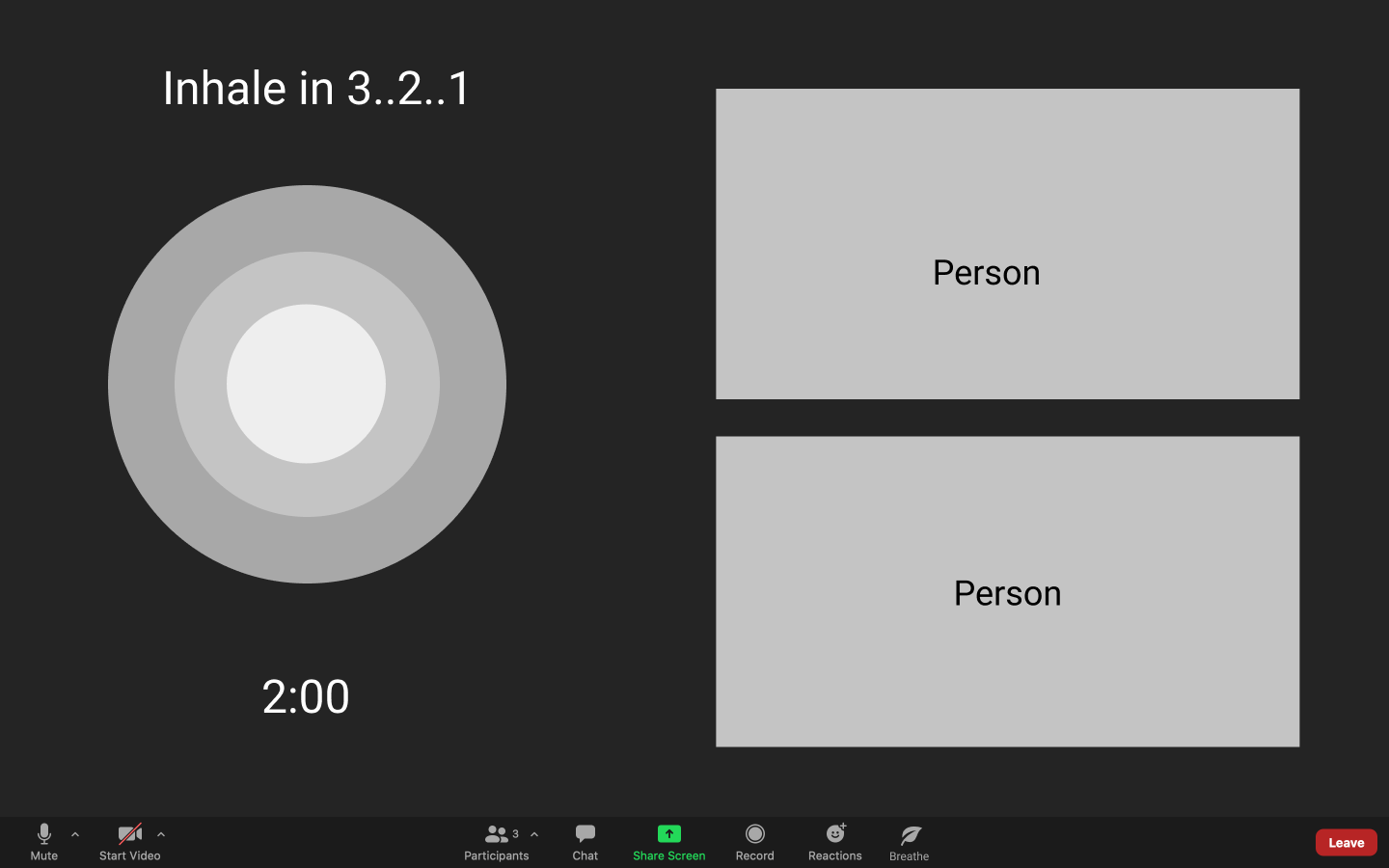
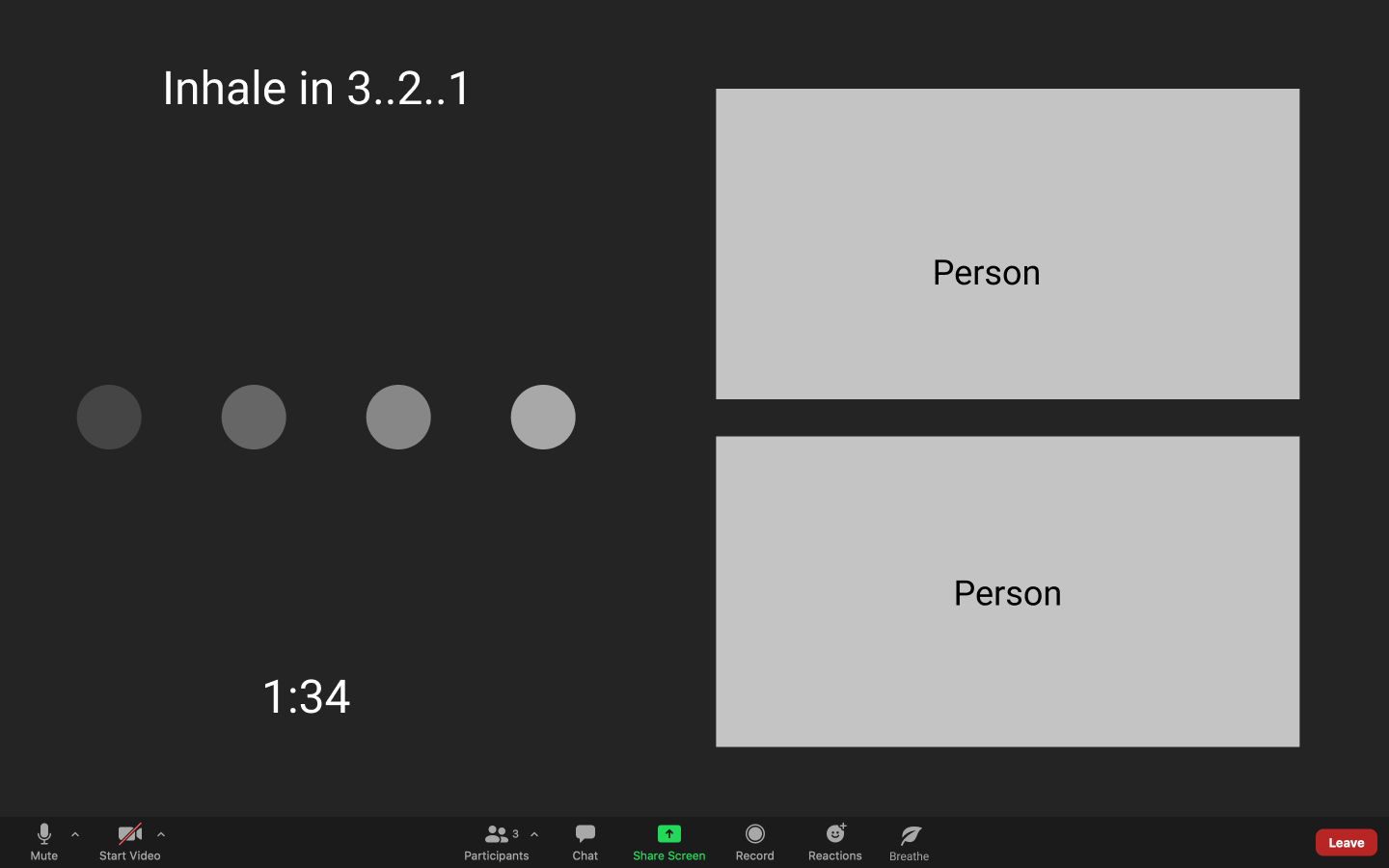
When developing our low fidelity screens, one thing we struggled with was a way to communicate breathing through static images, so we explored the use of motion.
Slider
Playing with the idea of aligning breaths to movement - each pass through the slider is meant to represent one inhale or one exhale.
Growing Circle
Exploring the theme of expansion and contraction - similar to breathing.
Loading dots…
Continuing to play with the idea of aligning breaths to movement - this time in dot form.
Usability Testing
We tested our interactive prototype remotely with three college-age participants over Zoom. Our goal was to walk the participants through the breathing exercise guide as if they were to actually use it, while taking note of their thoughts and reactions at each step. We also asked behavioral questions before and after the walkthrough to gauge their opinions about our prototype and their general Zoom usage. Performing our evaluations over Zoom actually worked in our favor, as our prototype is designed to be a remote interaction.
Usability Testing Findings
Insight 1: Many participants felt the breathing exercise itself was confusing and wanted more guidance and customizability.
Insight 2: The growing circle was a clear favorite among participants with some calling it ‘calming,’ or ‘it looks like breathing.’
Insight 3: Our data visualizations were said to be ‘helpful,’ but some of the elements like the breathing score were confusing and some found that too much information was presented
Re-evaluating our User Flows
Although all participants from the usability test successfully completed our tasks, Insight 1 - Wanting more guidance and customizability - made us rethink how we wanted to approach this Zoom feature. To help organize our thoughts, we developed and re-evaluated how our users flows should look like. This process helped us better map out areas that we had failed to design for in our low-fidelity prototypes and plan for development accordingly.
Final Solution
We continued iterating our solution following the insights we received from our usability test, and developed some high fidelity prototypes.
Introducing our facilitator!
Harry, our relaxed husky, provides guidances to our users and helps lead them through Breathe’s breathing exercises.
Get Started
Breathe takes advantage of Zoom’s existing navigation and prompts users once our facial scanning software detects stress on our users’ faces.
Scan Your Face
Our facial scan uses your existing computer camera to capture insights while providing live feedback on how the facial tracking progresses.
Understand Your Facial Scan Results
Our Facial Scan provides immediate feedback and insights onto users’ current stress levels based on a variety of factors such as stiff jaw or furrowed eyebrows.
Choose Your Excercise
Harry recommends a series of exercises tailored to you based on your results
Customize your Breathing Exercise
Don’t agree with Harry’s suggestions? Users can customize their breathing exercise to the length of their choosing.
Guided, Interactive Breathing Exercises
After selecting an exercise, Harry will guide you through
Interpret your Results
Our final results dashboard provides easy to read visualizations and explanations onto your stress levels both before and after the breathing exercise.
Reflection
Considering the short timeline of the project, a lot was accomplished! Exploring motion was a first for me, and I learned that keeping it simple often helps convey your message more clearly. If I had more time, some main goals would be to refine the UI and branding, explore how our new facilitator, Harry, can be incorporated and ensure our dashboards clearly convey our message.


